Skip to content
Mumara

Insights · live · at-a-glance

The screen every marketer checks before lunch.

Real-time counters across every send Mumara is processing — sends, deliveries, opens, clicks, bounces, complaints, unsubscribes. Per-campaign, per-drip, per-trigger, per-node. The at-a-glance answer to "is everything OK right now" without opening seven reports. When something looks off, drill into the specific campaign in one click.

Today

LIVE

SENT

2.4M

+18%

DELIVERED

2.38M

99.2%

OPENED

894K

37.5%

CLICKED

142K

5.97%

Last 7 days

Engagement trending up

All campaigns · across 5 sending nodes

Designed for the daily ritual

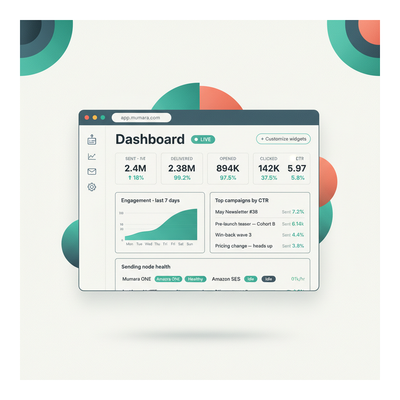
Built for the question 'is everything OK?', refreshed live.

The dashboard isn't where you write reports — that's Reporting & Analytics. The dashboard is where you check, fast, that nothing's burning. Most installations open it three or four times a day.

data, no refresh
Live
data, no refresh
Counters update as sends, opens, clicks, and bounces land. No 5-minute lag, no manual refresh, no 'data may be delayed' caveat.
7 days / 30 days
Today /
7 days / 30 days
Three default windows — pick the one that matches the question. Drill into a custom range when you need it.
breakdown
Per-channel
breakdown
See dashboards filtered to broadcasts only, drips only, triggers only, or any combination. Match the surface to the program.
to per-campaign reports
Drill-in
to per-campaign reports
Click any number on the dashboard to land in the full Reporting & Analytics view for that campaign. The dashboard is the entry point, not the dead end.

The full dashboard, in one screen

Stat tiles, trends, top campaigns, node health — pinned to your role.

The full Dashboard pinned with the widgets that matter to your role. Above-the-fold: live stat tiles for today's sends, deliveries, opens, clicks — with day-over-day deltas. Below: a 7-day engagement trend chart, a top-campaigns-by-CTR widget, and a per-node sending health widget. Customize widgets to swap any panel for a different one without losing what's pinned next to it.

  • Live stat tiles up top

    Sends, deliveries, opens, clicks — with green deltas vs yesterday's same time. The 60-second scan before standup.

  • 7-day engagement trend

    A sparkline-style chart in teal showing the engagement direction. Spot a drop before it becomes a deliverability incident.

  • Top campaigns by CTR

    Live-sorted list of campaigns by click-through rate. Click any campaign to drill into the per-recipient reporting view.

  • Per-node sending health

    Each connected sending node shows live throughput and a health pill. An idle or auto-deactivated node surfaces immediately so you spot the failure before customers do.

Mumara Dashboard with pinned widgets — four live stat tiles (Sent 2.4M / Delivered 99.2% / Opened 37.5% / Clicked 5.97%), 7-day engagement chart, Top campaigns by CTR list, per-node sending health row showing Mumara ONE, Amazon SES, SendGrid

Dashboard vs Reporting

Two surfaces, two questions, two daily rhythms.

The Dashboard and Reporting & Analytics aren't redundant — they answer different questions on different rhythms. Knowing which to open is half the speed of running a sending operation.

The Dashboard answers "is everything OK right now?" — checked multiple times a day, scannable in under a minute. Live counters, today's vs yesterday's deltas, sending-node health badges, anomaly flags. The dashboard is the first screen after sign-in for most admins; the screen pinned on the team's NOC display; the screen the campaign manager glances at between meetings. Live mode means the dashboard's authority is the freshest in the platform.

Reporting & Analytics answers "what happened on this specific campaign?" — opened a few times a week, often with a stakeholder in the room. Per-campaign drill-down across an 8-tab surface (Detailed Stats / Bounced / Opened / Clicked / Un-subscribed / Complaints / Logs / A/B). Per-recipient detail. Export options. The deep audit-and-attribution surface — where you build the case, present the findings, write the post-campaign retro.

Both surfaces are linked. The dashboard's tile labels are clickable; clicking lands you in the Reporting view filtered to the dashboard's context (today's broadcasts, this drip group, this trigger). Bouncing back and forth is one click; you don't lose state.

Three roles, three default dashboards

Same data. Different defaults. Pin what your role cares about.

The widget set is customisable per admin. Mumara ships sensible defaults that match the three roles most marketing operations have.

Campaign Manager

Send-quality default

Top tiles: Sent today, Opens, Clicks, Unsubscribes. Sparkline of 7-day engagement. Top 5 campaigns by reach. Top 5 by click rate. The CM's job is the campaign itself — this dashboard surfaces the questions a CM has between sends: how did the last one do, what's next, who's not engaging.

  • Sent / Opens / Clicks tiles
  • 7-day engagement trend
  • Top campaigns by reach
  • Top campaigns by CTR

Deliverability Lead

Reputation-floor default

Top tiles: Bounce rate, Complaint rate, Suppression growth, Sending-node health. Per-node throughput sparkline. Per-domain bounce breakdown. The DL is watching reputation drift — this dashboard surfaces the things that move slowly until they're moving fast.

  • Bounce + complaint rates
  • Per-node health
  • Per-mailbox-provider breakdown
  • Suppression growth

Exec / Stakeholder

Outcome-summary default

Top tiles: Total sends this month, Aggregate open rate, Aggregate click rate, Revenue-attributed clicks (if tracking-pixel attribution is configured). Month-over-month deltas. The exec wants the trend, not the operations. This dashboard fits on a single screenshot for the weekly update.

  • MTD aggregates
  • MoM deltas
  • Attribution-ready summary
  • PNG-export-ready

The morning routine

From sign-in to confident, in under a minute.

The 90-second flow most campaign managers run before they start their day. The dashboard is designed for exactly this — get the answer, drill if needed, move on.

  1. Step 1

    Sign in

    The dashboard is the default landing page. Your role's pinned widgets load first; everything else is one click away.

  2. Step 2

    Scan the headline tiles

    Sent / Delivered / Opened / Clicked / Bounced / Complained — six numbers, three seconds. Compared to yesterday's same-time. Green deltas mean keep going; red deltas mean look closer.

  3. Step 3

    Spot the anomaly

    A higher-than-normal bounce rate. A complaint spike on one campaign. A sending node with a yellow health badge. The anomaly surfaces visually before you read the numbers.

  4. Step 4

    Drill into the cause

    Click the anomalous tile. The dashboard hands off to Reporting & Analytics, filtered to the campaign or node behind the number. Now you're in the per-recipient detail or per-node breakdown that explains the spike.

  5. Step 5

    Share or move on

    If you need to escalate (deliverability incident, exec update), Export PNG / PDF for the share-able summary. If everything's fine, close the dashboard tab and get on with the day.

Different shapes of monitoring

One Dashboard surface. Four ways teams use it.

  • Campaign manager

    Role
    Five broadcasts went out yesterday. You want to know which lit up, which fell flat, and whether anything needs follow-up before the team standup at 10am.
    What the dashboard delivers
    Top-campaigns-by-CTR widget surfaces winners and losers. Per-campaign tile click drills into the recipient-level report when you need to investigate the underperformer. Standup takes 4 minutes instead of 14.
  • Deliverability lead

    Role
    You're watching the bounce + complaint floor for the whole installation. A slow drift on either metric is the first warning of a reputation incident two days away.
    What the dashboard delivers
    Reputation-floor dashboard surfaces 7-day bounce trend, complaint rate, per-mailbox-provider breakdown. Anomaly badge on a sending node tells you which gateway needs investigation before the rate climbs further.
  • Exec weekly update

    Role
    Friday afternoon, exec wants this week's numbers in one screenshot. Total sends, aggregate engagement, MoM trend, attribution-ready summary.
    What the dashboard delivers
    Exec dashboard preset surfaces MTD aggregates with MoM deltas. Export PNG creates the screenshot. Paste into Slack or the weekly doc. Zero data-prep time.
  • Operations / NOC

    Role
    An overnight-shift operator monitors the platform health while batch sends run. Per-node throughput, error rates, queue depth — the question 'is anything stuck?' at any hour.
    What the dashboard delivers
    Per-node health widget shows real-time send rate, error count, queue depth. Auto-deactivated nodes surface immediately with the error captured. Operator wakes the right person if needed; otherwise lets the rotation handle it.

Common questions

What buyers usually ask.

Does 'live' really mean live?

Yes — counters update as events land, not on a schedule. An open happens, the dashboard tile increments seconds later. The Live pill in the corner has a small pulsing dot when fresh data is flowing; if you lose the data pipeline (very unusual) the pill turns slate and the timestamp shows when the last event was processed. There's no fixed refresh interval — it's true streaming where the platform supports it.

What's the difference between this and Reporting & Analytics?

Different surfaces, different questions. The Dashboard answers 'is everything OK right now?' — checked multiple times a day, scannable in under a minute. Reporting & Analytics answers 'what happened on this specific campaign?' — opened a few times a week, often with a stakeholder in the room. Both surfaces share the same underlying data; the Dashboard's tile labels are clickable and drill into the Reporting view filtered to that context. See [Reporting & Analytics](/campaigns/features/reporting-and-analytics/) for the deep surface.

Can I customise which widgets I see?

Yes — pin and unpin widgets per admin. Three role defaults ship out of the box (Campaign Manager / Deliverability Lead / Exec), but each admin can override their own layout. Choices persist per-admin; what your colleague sees on the dashboard isn't what you see, unless you choose the same widgets.

Can I filter by channel — broadcasts only, or drips only?

Yes. The dashboard has a channel filter at the top — broadcasts, drips, triggers, A/B tests, evergreen runs. Pick any combination. Common patterns: a marketer who only runs broadcasts uses the broadcasts filter; a deliverability lead views everything because reputation is global; an exec views all channels for the aggregate story.

How does drill-in work?

Every number on the dashboard is clickable. Click the Sent tile — you land in the Reporting view filtered to today's sent campaigns. Click the per-campaign row — you land in that specific campaign's 8-tab report (Detailed Stats / Bounced / Opened / Clicked / Un-subscribed / Complaints / Logs / A/B). Drill-in preserves the time-window context, so 'today's bounces' on the dashboard becomes 'today's bounces for this campaign' in the report.

Can the dashboard exclude bot opens?

Yes — the Exclude Bots toggle lives in the reporting surface but applies to the dashboard tiles too. With it ON, the Opens tile shows human-opens-only (best estimate, based on common bot signatures). With it OFF, the tile shows raw opens including known prefetch behaviour. Useful when comparing to industry benchmarks.

Can I export the dashboard for a non-admin stakeholder?

PNG / PDF export buttons on every widget — pick the time window, click Export, share the file. Useful for the exec weekly update, the agency-to-client status report, the post-incident timeline. The exported file is timestamped so there's no ambiguity about when the data was captured.

What about multi-user dashboards?

Admins see aggregate data across the installation. Users see only their own data on their dashboard. Reseller and agency setups use the per-user dashboard as the client-facing view — same widget surface, scoped to one tenant's traffic. See [Team & Users](/campaigns/features/user-management/) for the hierarchy.

Does the dashboard work on mobile?

Yes — responsive layout. Tile grid stacks on phone screens; widgets re-flow to fit. For day-to-day check-ins, mobile is fine; for serious investigation use desktop. The drill-in to per-campaign reports also works on mobile but the 8-tab reporting surface is denser there.

Mumara Campaigns · Dashboard

Live counters. Pinned widgets. One-click drill-in.

The Dashboard & Statistics surface ships with every Mumara Campaigns plan — Self-Hosted and Mumara Machine. Live mode, per-role default layouts, channel filters, drill-in to Reporting & Analytics, export-ready for stakeholder updates. The screen you actually open three times a day.